
Sushi Chan is a little food court kiosk with big ambitions. Be Friendly was engaged to re-brand the store and differentiate it in a crowded and largely generic marketplace.
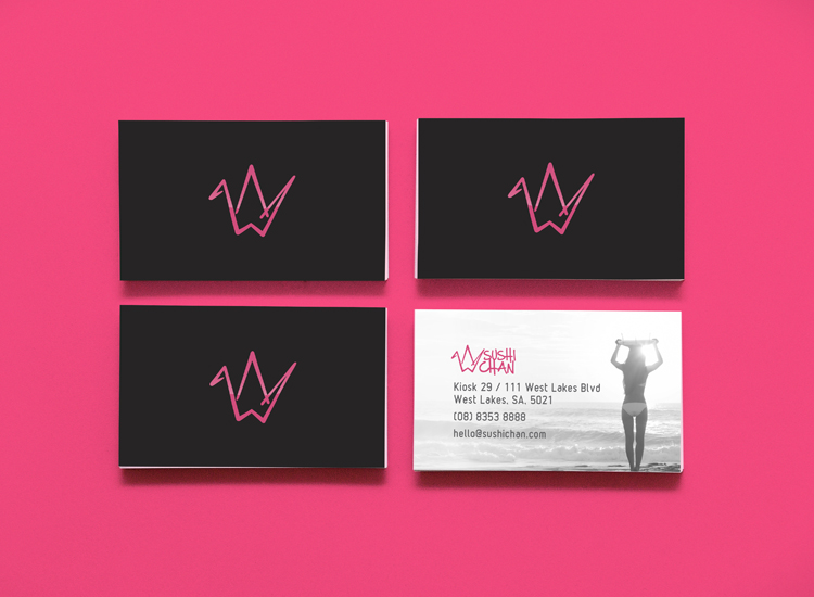
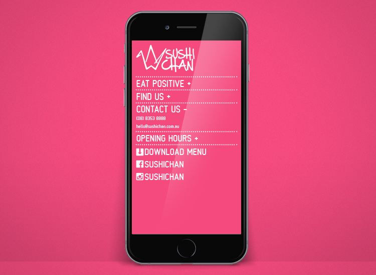
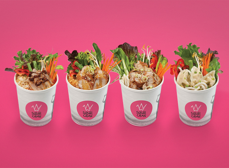
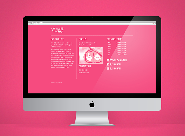
Evolving from a sushi stand (as the name suggests) Sushi Chan encourages customers to “Eat Positive” – whole grains, fresh veggies, lean proteins – all the good stuff you know you’re supposed to eat. So it’s not just sushi and it’s not just Japanese, and the branding reflects that. An origami crane (tsuru) and text in a calligraphic style (shudo) give a nod / respectful bow to the store’s origins; while clean, crisp, light design cues reflect the menu and the owner’s intention.
いただきます!
Food photography by ASB. Food styling by Be Friendly.